olive
Company: thomas Ford & Sons
Designer: tom ford
Hood: prime pro
PHOTOGRAPHER: Victoria Somerset-Howe Photography

balance & function
Kitchen choices and layouts in a grand space are a surprisingly tricky skill for a designer to get right. The right balance between furniture complimenting, and dominating the aesthetics of a space with the wow factor before furnishing, requires attention to detail. A balancing act accepted by Tom, of Thomas Ford & Sons, when first considering the incredible “Olive” project.
The project brief given to Tom, emphasised enhancing the space while maintaining balance and function, along with providing a family haven for relaxation while retaining a sense of the scale and grandeur of this incredible space.
The clients were heavily involved in designing their home. Specifically, they engineered and constructed the steel framework for the windows in their garden themselves, paying close attention to every detail to ensure structural perfection, and enhancing the already impressive space both internally and externally.
Reflecting on this high level of detail and precision was crucial for Tom to ensure the success of the design. With grown-up children, the family often had many guests to feed, especially on special occasions. Because of this, the room needed to feel social yet be functional and comfortable for everyday use.
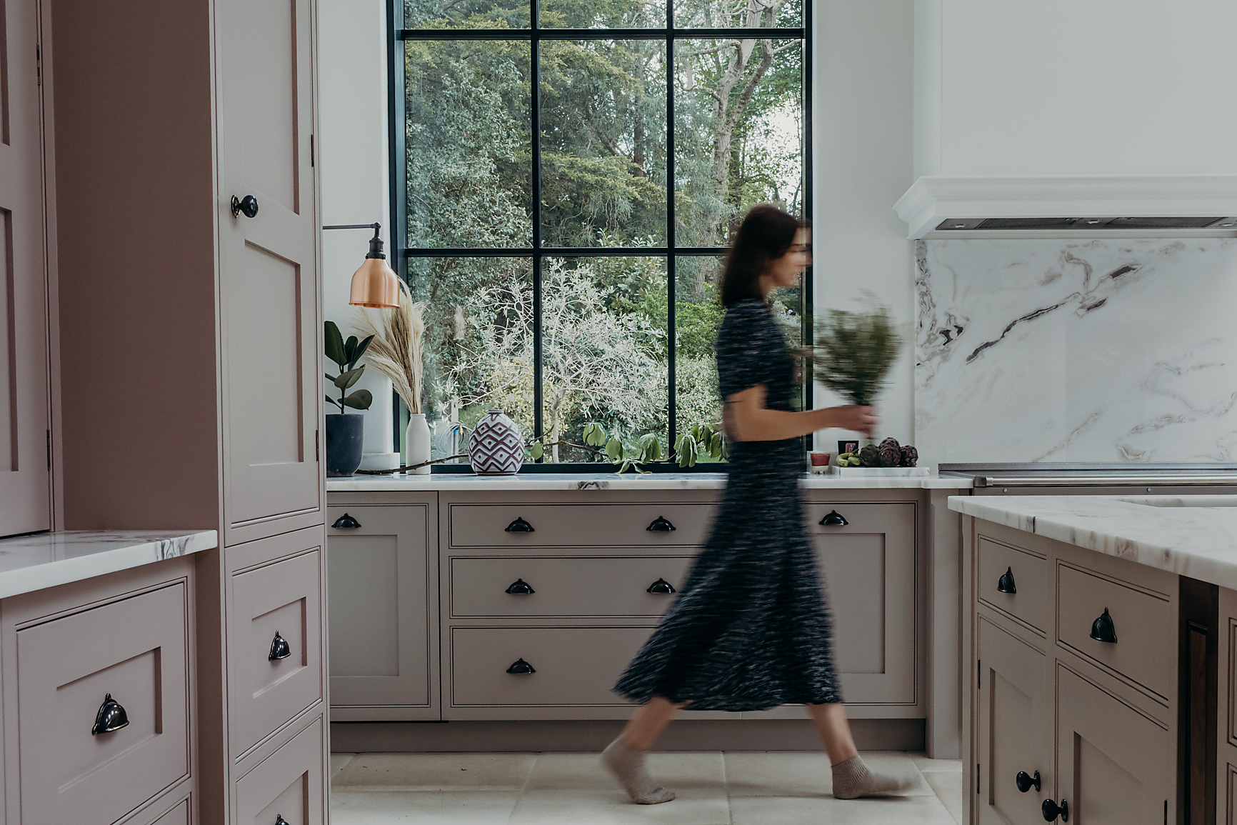
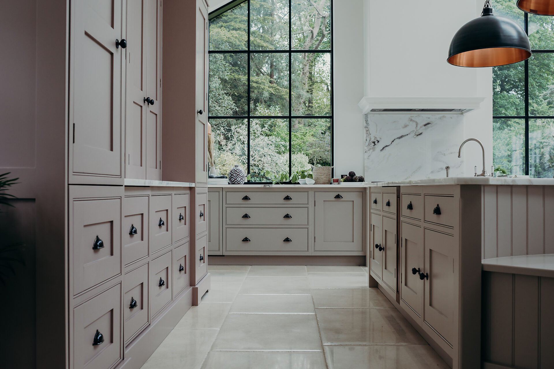
The room has particularly high ceilings of up to five metres at the highest point, with a large, open floor plan and feature Crittall style window, framing the centre of the room and leading your eye into an expanse of greenery in the garden beyond, it was essential to draw the eye through this area by keeping gaps around the furniture wide and fluid. We produced an uninterrupted path to the windows and the cooking zone in front of the garden.
Working in this vast space, the main objective of the Thomas Ford & Sons team was to make it feel balanced. This was achieved by designing free-standing furniture with symmetry at its core.

zoning
The all-important elements for everyday use of the kitchen needed to be within reach, so making, in particular zoning, was essential. ensuring that each area of the design worked hard and interacted appropriately with the next. The dresser that dominated the uninterrupted back wall houses all of the daily items the family need at hand with ease. A hot tap and prep sink, with fridge below for milk and spreads. Plenty of deep shelves for daily dry goods, herbs and spices that are used regularly are housed in dedicated and organised spice racks. With full-height shelving above and deep draws below for everyday crockery, tableware, mugs and glasses.
For a family of keen cooks, a Falcon range cooker was specified, and paired with the Westin Prime Pro, ensuring the maximum amount of fumes are extracted by the internal twin motors as possible on the first pass. This choice of hood was a vital element in the design due to the bespoke chimney housing which rises the full five metre height to the apex of the pitched ceiling, and the possibility that without the extra power provided by the Prime Pro, fumes could escape over the sides and be lost into the room.
A hidden pantry was also added to the design, affording endless storage for the supplies, tins, bags and jars and providing an area that hides away the things we do not always need or need to see.
The result
The end result is a kitchen area with furniture that not only compliments and enhances the beautiful, social space, but classically muted tones allow the whole room and garden beyond to be rightly, the undisputed star of the show.
get in touch
We’ll be in touch as soon as possible. Thank you.